Evolution Physical Therapy: Event branding
The Challenge
Our client, an award-winning physical therapy office, approached us with the exciting task of designing and producing event collateral to commemorate their five years in business. They wanted a celebration that not only reflected their brand's identity but also symbolized the evolution and growth they had experienced during these significant five years.
The Solution
Our solution to create a memorable and visually captivating event revolved around the idea of using a watercolor graphic as a metaphor for evolution, effectively aligning it with the office's brand name and visual identity.
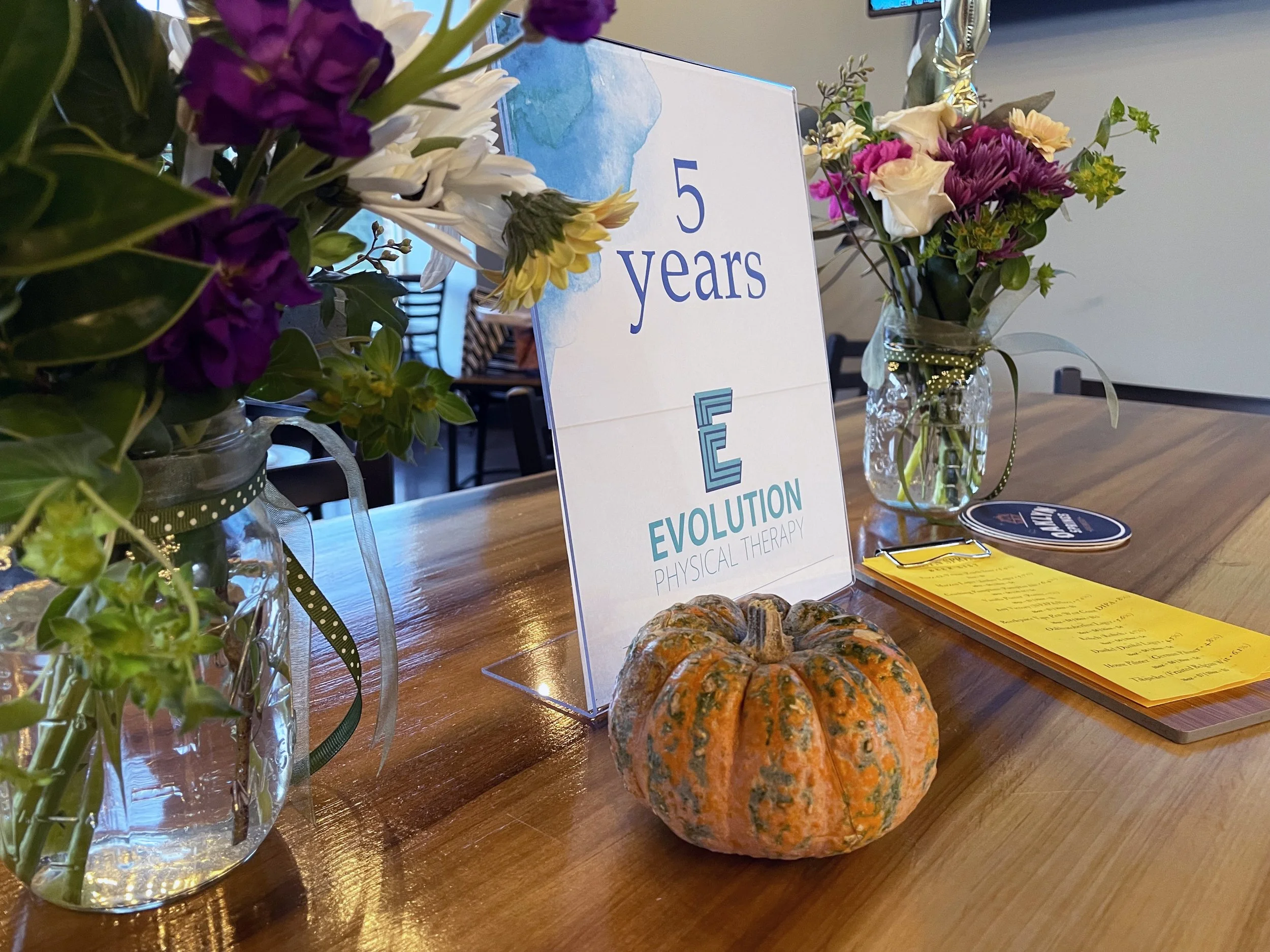
This visual element represented the idea of fluidity, growth, and transformation, mirroring the progress and development of the physical therapy office. The colors of the watercolor graphic were thoughtfully altered to harmonize with the brand's established color palette, ensuring a seamless and consistent brand experience.
To create a cohesive event, we designed a range of signage including print for table-top and digitally animated signage for the large format screens at the venue. These materials featured the watercolor graphic and were strategically placed throughout the event space, effectively reinforcing the theme and brand message. The print signage served not only as informative pieces but also as eye-catching decor that set the stage for the celebration.
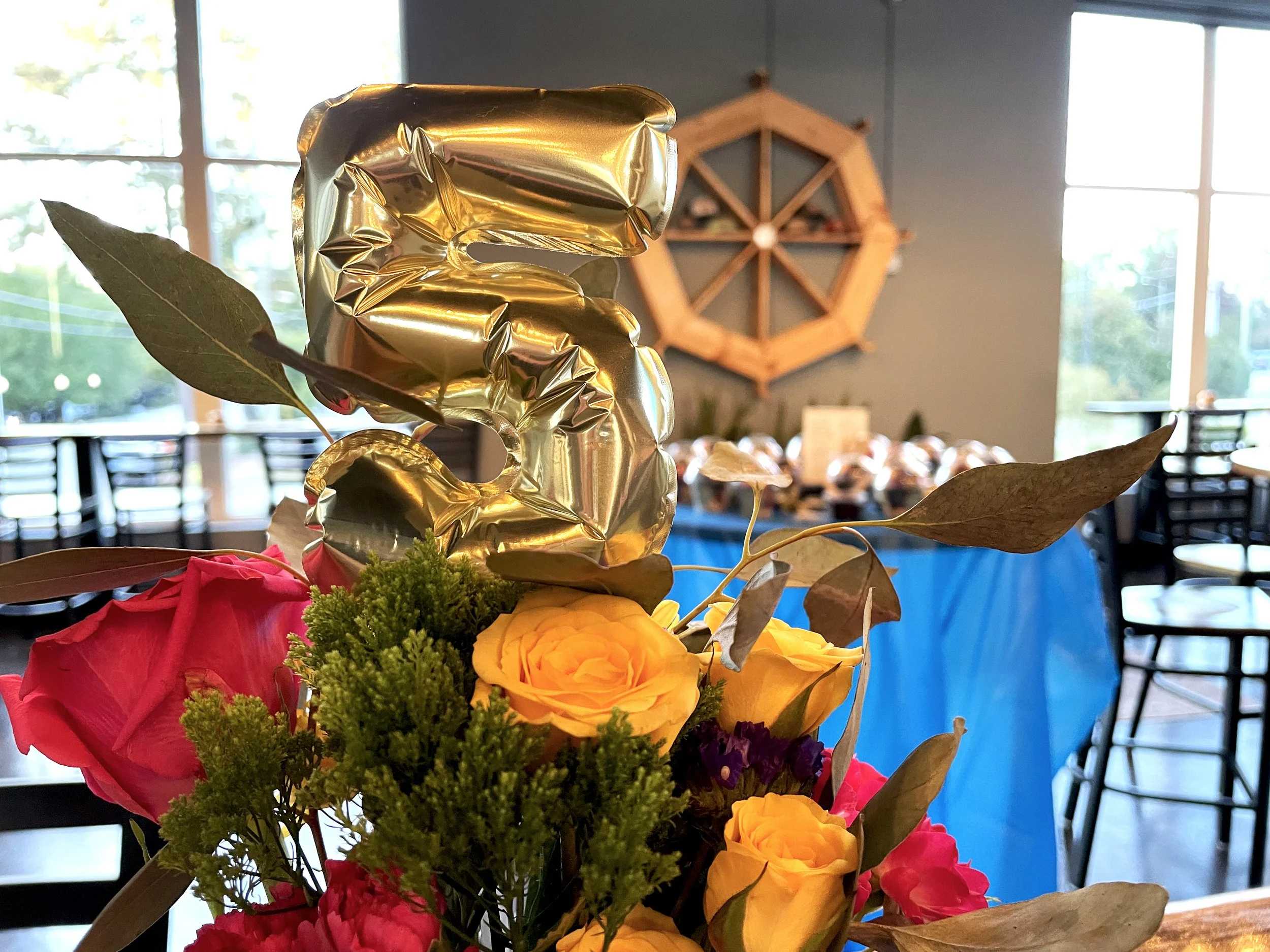
To enhance the event's aesthetics and atmosphere, we also extended our creative approach to the floral arrangements by carefully curating a selection of flowers and greenery that complemented the space along with 5-year celebration accessories.
Results
This event was not only a successful celebration but also a testament to the enduring commitment to excellence and progress of the physical therapy office.
Credits
https://www.evolutionnc.com, Jessie Mathers, Robin McLoughlin


